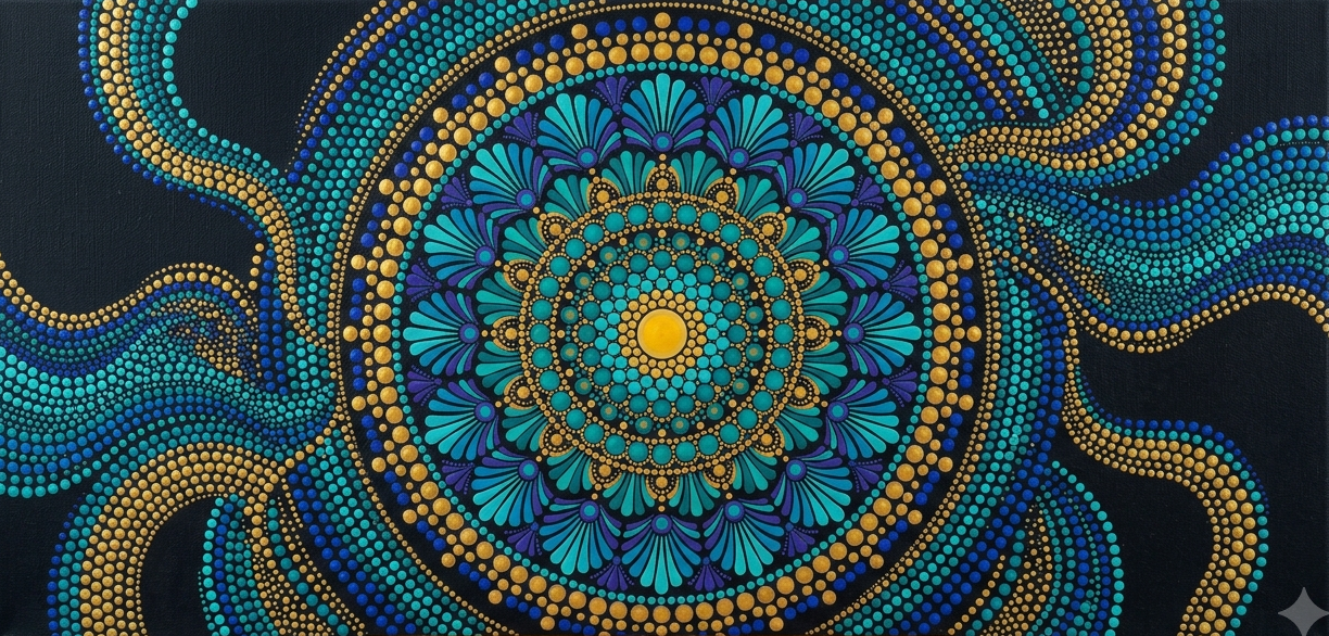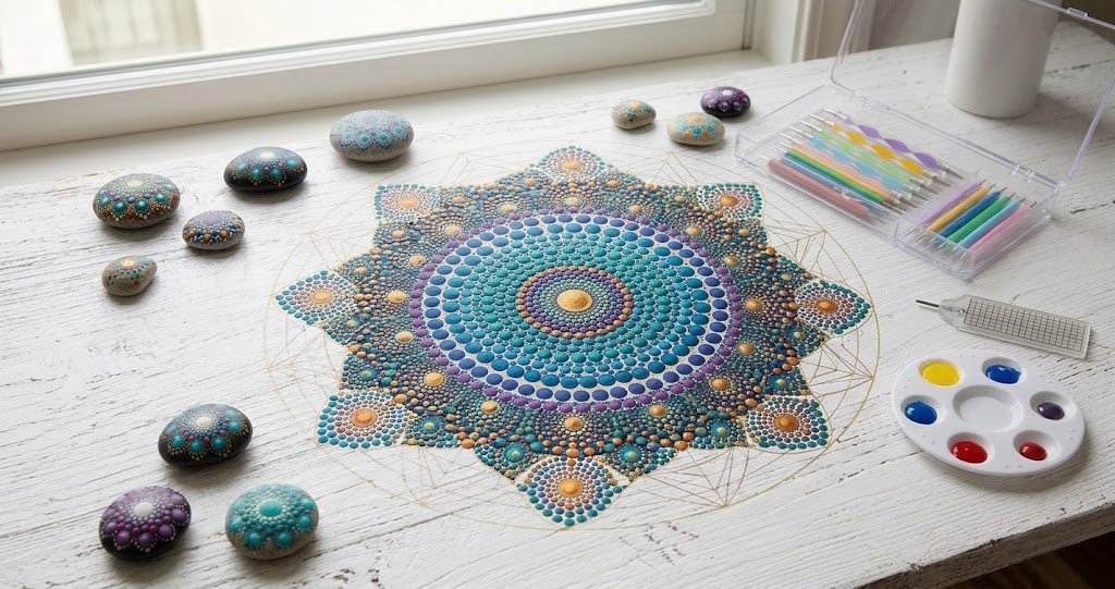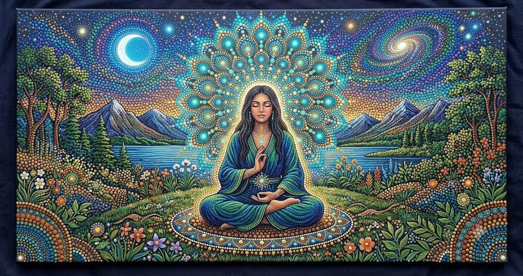


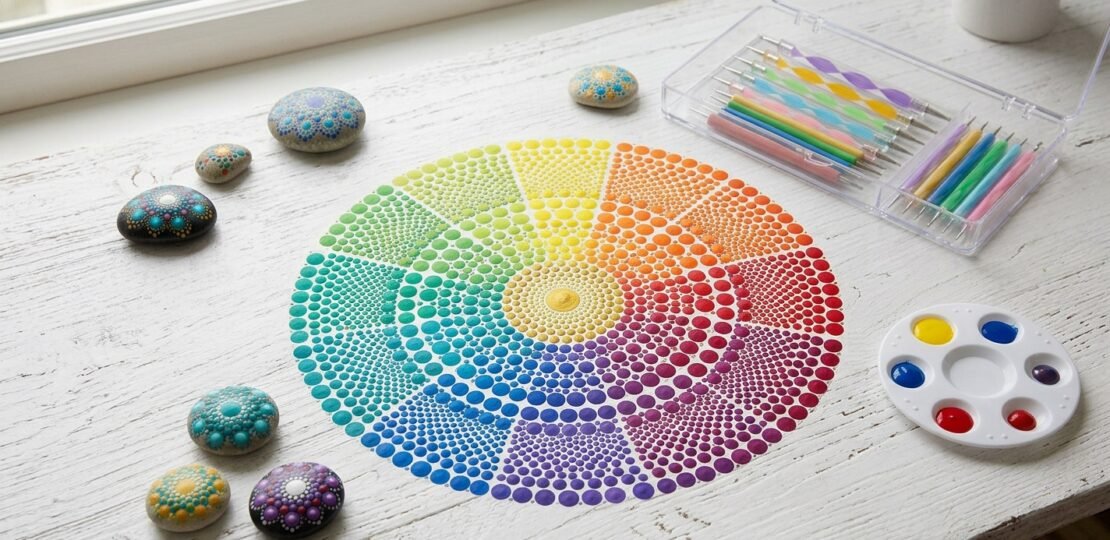
Color plays an enormous role in dot art compared to many other mediums, as the visual impact of a piece depends almost entirely on how colors interact across countless small points rather than through smooth, blended brushstrokes. A foundational understanding of the color wheel helps artists make confident creative choices while deepening the connection between aesthetic selection and mindfulness. Primary colors serve as the building blocks for secondary and tertiary shades, but their placement relative to one another determines the energy of a piece. Complementary colors, positioned opposite each other on the wheel—such as blue and orange or red and green—generate vibrant contrast and dynamic visual energy when set side by side. Conversely, analogous colors sit adjacent on the wheel, like blues, greens, and blue-greens, yielding harmonious and serene palettes that naturally lend themselves to meditative artwork. Additionally, balancing warm tones—which feel energizing and visually advancing—with cool tones—which evoke calmness and subtle recession—allows the artist to shape the spatial depth and emotional atmosphere of every design.
Beyond simple color harmony, dot art relies heavily on optical mixing, a principle central to 19th-century Pointillism. Because individual dots of pure pigment sit next to one another rather than being physically mixed on a palette, the human eye and brain perform the blending at a distance. For instance, placing fine blue and yellow dots in close proximity causes the viewer to perceive green from a few feet away, producing a luminous, shimmering quality that flat, pre-mixed paint rarely achieves. Because viewing distance fundamentally transforms how a piece is perceived—turning a collection of distinct dots into seamless gradients—artists benefit from regularly stepping back while working to observe how their design coalesces from afar.
When selecting a color scheme, structured yet simple approaches prevent decision fatigue and support a focused creative state. Beginners often thrive with monochromatic palettes, which rely on variations in the tint and shade of a single hue to create a deeply soothing, low-stress environment ideal for meditative practice. Two- or three-color combinations offer another effective path, keeping choices deliberate and cohesive. Artists can also explore culturally referenced palettes, such as the traditional ochres, reds, blacks, and whites utilized in Aboriginal dot painting, drawing inspiration from these rich historical roots with contextual understanding and respect.
Color choices also carry informal emotional associations that interact closely with personal mood and present-moment awareness. Cool blues and greens tend to foster relaxation and open quietude, vibrant reds and oranges ignite energy and vitality, purples encourage introspection, and sunny yellows evoke optimism and lightness. Rather than treating these associations as rigid rules, artists can view them as intuitive starting points, paying close attention to their own immediate internal responses to each hue. Color selection itself can become an ongoing exercise in present-moment awareness: instead of pre-planning every shade in advance, one can pause before placing a dot and simply notice which color feels right in that exact moment.
RELATED POSTS
View all